1 Name: Nakuro : 2015-11-19 13:40 ID:N0Og86mz [Del]
I believe we should have a logo something you can put on your car or on the wall of your school to show that there is a Dollars member in the area.
Post your suggestions and I will make a straw-pole with the best suggestions and you can all vote for which you think should win.
2 Name: Xiphon !iYNUgt.zVM : 2015-11-19 13:43 ID:piNEblNe [Del]
We have one, it would just be our usual logo. Good idea though
3 Name: Nakuro : 2015-11-20 09:35 ID:N0Og86mz [Del]
I meant something more subtle like a letter or some marking not something are bold as the circle with the Dollars in the middle
4 Name: Jack Chronicle !8ZJ1cWL5vY : 2015-11-20 11:35 ID:W+0n32Ly [Del]
Maybe it could be "DLLR"
5 Name: Edenstudent : 2015-11-20 13:30 ID:A0gHg3ZG [Del]
What about like a dollar sign, $, but a "D" with a line through it instead of the "S". Does that make sense?
6 Name: Aren : 2015-11-21 22:23 ID:t+8Uq+ln (Image: 2592x1944 jpg, 355 kb) [Del]

what about one of these?
7 Name: Kazzeki !onM6csN8pc : 2015-11-21 23:52 ID:qaSK7c3c (Image: 400x400 jpg, 8 kb) [Del]

8 Name: Bnn~!/FsopyQZxE : 2015-11-22 09:42 ID:8MAfdxVs (Image: 2480x3507 png, 452 kb) [Del]

I created Codes, they are very easy.
9 Name: 8man : 2015-11-22 10:11 ID:wINX/X+1 [Del]
I'm really liking Aren's design. Either of those two would be cool with me. But I do like the one with the line going horizontally instead of the verticle up down
10 Name: srena : 2015-11-22 12:05 ID:tyKUu+Br [Del]
>>8 what the meaning H-4 is???
11 Name: Edenstudent : 2015-11-22 13:47 ID:irazHpV8 [Del]
The idea I was thinking of was like Kazzeki, but with a single line. However, seeing Aren's ideas, I really like the one on the right.
12 Name: Yato!6SSyzd7Qgs : 2015-11-22 17:02 ID:0jRVj+23 [Del]
We have a DOLLARS logo, just look at the top left of the screen
13 Name: Edenstudent : 2015-11-22 20:39 ID:irazHpV8 [Del]
That's a little complex for a simple logo. It is certainly an important symbol, but not logo material.
14 Name: Kazzeki !onM6csN8pc : 2015-11-22 21:14 ID:MpldMoA4 [Del]
>>12 That one's copyrighted sadly :(
>>11 Agreed, I like Aren's too
>>10 Would like to know as well.
15 Name: Nakuro : 2015-11-23 09:24 ID:N0Og86mz [Del]
Hello everyone
I am glad you all think that this is a good idea I have created a poll so you may vote for whichever logo you like
Link http://strawpoll.me/6080631
Link to the thread if you want to share it and have someone else vote http://dollars-bbs.org/suggestions/res/1447962008.html
Thanks to those who submitted designs and I hope this will help us grow the Dollars netwrok
16 Name: Roderich !p4fj3qSEuc : 2015-11-23 10:48 ID:pQP5SQZI [Del]
why are we changing this? and what authority or right do we have to change it?
17 Name: Nakuro : 2015-11-23 12:53 ID:N0Og86mz [Del]
We aren't changing the actual Dollars Logo like to one you see on the top left but we are creating a sorta call sign (Im using a school as an example) something that you can draw on the wall of you school or your backpack showing that you are a Dollar or that there is a dollar in the area.
18 Name: Edenstudent : 2015-11-23 18:09 ID:irazHpV8 [Del]
Thank you for explaining and clearing all that up, Nakuro. A couple people have been a little confused about this.
19 Name: Areigarei !5pdCi1JxAc : 2015-11-23 21:33 ID:0jTsAlFN [Del]
There has only been 5 voters -_-
20 Name: Kazzeki !onM6csN8pc : 2015-11-23 21:57 ID:MpldMoA4 [Del]
21 Post deleted by user.
22 Name: Kazzeki !onM6csN8pc : 2015-11-25 11:33 ID:MpldMoA4 [Del]
bump
23 Name: Jack Chronicle !8ZJ1cWL5vY : 2015-11-25 13:29 ID:W+0n32Ly [Del]
Just saw the poll, looks like Arens is winning. When does it close though?
24 Name: Nakuro : 2015-11-25 15:53 ID:9hHd68qC [Del]
The poll ends the 5th of December
25 Name: Sui : 2015-11-26 19:12 ID:Dlj7aALR [Del]
Every dollar member has to vote for this to be fair.
26 Name: Kazzeki !onM6csN8pc : 2015-11-26 22:02 ID:O2uUKpOO [Del]
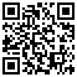
rebump
27 Name: CallmeSir : 2015-11-26 23:04 ID:iKxuWHF+ (Image: 750x750 jpg, 126 kb) [Del]

How about something simple like this?
28 Name: blue : 2015-11-27 19:12 ID:g7tPmnBo [Del]
the final decision is based on what the founder thinks, i don't think it should change cause its based off of the anime and the current one inst that bad. but i do think that logo above could be a secondary logo.
29 Name: Anonymous : 2015-11-28 21:33 ID:9hHd68qC [Del]
bump
30 Name: CuSith !gP.YlRvdlA : 2015-11-30 00:22 ID:uV4RtYI4 [Del]
I think we stay with the anime's symbol. but otherwise its a good idea
31 Name: Anonymous : 2015-12-02 22:28 ID:ISomFCDq [Del]
Just curious, but when will you have the final decision of what symbol we should use?
32 Name: Nakuro : 2015-12-04 10:20 ID:N0Og86mz [Del]
The voting ends tomorrow the symbol with the most votes wins
33 Name: Tósuto : 2015-12-04 11:58 ID:1UF84FoW [Del]
Just keep the symbol the same as the anime
34 Name: Tósuto : 2015-12-04 11:59 ID:1UF84FoW [Del]
I think that would be pretty good
35 Name: CallmeSir : 2015-12-04 20:14 ID:iKxuWHF+ [Del]
>>32 Are we not including mine?
>>27
36 Name: Aren : 2015-12-04 22:37 ID:G/b0RxU6 [Del]
>>35 the poll had already been made by the time you posted.
37 Name: ひとリ : 2015-12-05 23:57 ID:d//0yQns [Del]
i like the idea, and yeah, maybe we could use that ^
38 Name: Shiro !FKk4keqK9w : 2015-12-06 15:18 ID:K+adZmjf [Del]
bump
39 Name: Nynx : 2015-12-06 22:27 ID:i9bgkxWM [Del]
Hmmm... I feel like we could use the logo as like a contact device if we meet DOLLARS out IRL. Much like a secret code that if someone else who's in the DOLLARS could know who else is one by that logo.
40 Name: Sigiled Hawk : 2015-12-07 08:34 ID:+GRvAXM8 [Del]
just use the map. How is this information so easily ignored...we have a map! Contact info is found on there.
41 Name: Oni : 2015-12-08 13:56 ID:/f4ZjqEh [Del]
wait we have a map?
42 Name: Leo The Lion : 2015-12-08 15:04 ID:CTp5NOc/ [Del]
>>40 we cant use the map all the time, plus if a dollars member is out in the open and sees the symbol, they can use code to reply back. its not that everyone is ignoring the map, we just dont know about all the cool features.
43 Name: Leo The Lion : 2015-12-08 15:09 ID:CTp5NOc/ [Del]
Or we could use our Dollars E-mail/username under the symbol, so that we can be contacted directly.
44 Name: Kazzeki !onM6csN8pc : 2015-12-09 20:33 ID:O2uUKpOO [Del]
>>41 yup we do have a map
45 Name: Nakuro : 2015-12-10 11:32 ID:N0Og86mz [Del]
Sorry it took me so long but I couldn't find the thread the winner is Aren with their design thank you to all who participated.
46 Name: Kazzeki !onM6csN8pc : 2015-12-22 11:43 ID:O2uUKpOO [Del]
Congrats Aren!
47 Name: Izaya : 2015-12-23 09:12 ID:YfnXRWRw [Del]
There's a code on here? Well, didn't know that, can anyone provide me with the post link? And, currently designing A logo, for each country, its taking some time however.
48 Name: Mikano : 2015-12-23 19:31 ID:LhDqpMyM [Del]
I thought The Dollars were suppose to be transparent, thus not needing of a logo.
49 Name: Kuroseijo : 2015-12-23 21:28 ID:K6AwNkrX [Del]
>>8 How'd you translate that message into those numbers? Teach me please. I'm quite interested.
50 Post deleted by user.
51 Name: firelily : 2015-12-24 15:27 ID:KUAkNPIF [Del]
yall stop replying to this, there is a post on main where yall should talk about this
stop bumping this over things in the correct place
52 Name: Bukuro : 2015-12-26 21:02 ID:8Nu8xqCM [Del]
I really like kazzeki's idea. Would it be wrong for me to spray paint it all over my town? Lol jk jk
53 Name: Enigma !C8Yxj7ZQY6 : 2015-12-27 18:48 ID:sJ1p7lmR [Del]
We have a symbol.
54 Name: Paradox(!E9k1wjKgHI : 2015-12-30 04:01 ID:yP0NJe0P [Del]
How about a simple $D? Wouldn't that be simple? Or Kazzeki's idea!
55 Name: FindMuck : 2015-12-30 04:18 ID:ldcMUlwW [Del]
The QR code would be discreet -->
56 Name: Enigma !C8Yxj7ZQY6 : 2015-12-30 11:54 ID:sJ1p7lmR [Del]
http://dollars-bbs.org/art/res/1451363896.html
57 Name: robotlix : 2015-12-30 11:58 ID:y5Da0MY4 [Del]
i like the $D it looks cool
58 Name: Lord Vlad : 2015-12-30 15:25 ID:JQg4uA2J [Del]
I think we should for sure have a logo-kind of stuff that is DRAWABLE and we can put on our things to show discretely to others that we are dollars.
59 Name: Okami Chan : 2015-12-30 18:52 ID:8fXQRlz+ [Del]
Woooooooooow~ This is a really cool and good idea!!
60 Name: Dotakin : 2015-12-31 01:29 ID:fdK5Q12n [Del]
Yes. A logo or a sign/symbol would be good. Maybe one that also that represents something good. I'll do some research and see what i can find. That is drawable or can be easily drawn
61 Name: Dotakin : 2015-12-31 01:36 ID:fdK5Q12n [Del]
I like aren's design. We should either to show that there are Dollars in the area with Aren's design. I really like his design :P.
62 Name: Cecida : 2016-01-01 12:58 ID:mJ8cl8o1 [Del]
I also really like Aren's, it's fairly simple, so most people should be able to draw it, but it's still pretty cool!!
63 Name: Lord Vlad : 2016-01-07 09:18 ID:3vsMz/xS (Image: 1000x1000 png, 26 kb) [Del]

I'm thinking of something like this, actually.
It's simple to draw and it takes the D and the $, without being too style inclined. Well, this is fastly made on gimp, but feel free to improve it.
Creative common !
64 Name: Lord Vlad : 2016-01-07 09:21 ID:3vsMz/xS (Image: 1000x1000 png, 23 kb) [Del]

better version, without the dots at some corners
65 Name: JosephLa2 : 2016-01-07 11:59 ID:58rOtDaS [Del]
The 7th comment looks good.
66 Name: JosephLa2 : 2016-01-07 12:00 ID:58rOtDaS [Del]
So yeah, i vote for the pic in the seventh comment.
67 Name: Arsana : 2016-01-07 17:24 ID:rcL+kwt6 [Del]
I like the seventh also~
68 Name: CloudStrife : 2016-01-07 17:30 ID:+WxEFDVZ [Del]
>>27 I vote for this. I like
>>7 too, but I believe we should keep the aesthetic of everything; you know, keeping the logo similar to the way the show had it. But if not possible,
>>7 would be my plan B.
69 Name: Lurker : 2016-01-07 17:53 ID:A8e7nehc [Del]
The Dollars logo is in the top left corner of the screen, silly.
70 Name: Lord Vlad : 2016-01-07 21:48 ID:3vsMz/xS [Del]
>>69This logo is of course beautiful, but not easy to draw, you'll agree. It would be perfect to have something easier to make with some paper and one pen, in a few seconds. If you want to draw it on your things, good luck, but many people want something more, and there is no reason not to make it.
>>66 >>67 >>68 I'd like to highlight that the seventh needs 2 colors, so, if you have one color, it's already harder to get around it. Of course you could do it monochrome, then.
I like mine more, but they look quite alike.
71 Name: Lurker : 2016-01-07 22:06 ID:A8e7nehc (Image: 500x293 gif, 472 kb) [Del]

>>70No, I don't agree.
No, it is easier to just print it out and/or make decals of the logo from someplace like RedBubble if you want to stick the logo on your car or on your laptop. It's an inexpensive process.
No, there is no reason to make a new logo because it's more or less sacrilegious to the Dollars name.
I find it funny that some of the logo ideas resemble currency marks since that
isn't what the Dollars even
means. It isn't a reference to money. It's a sarcastic reference to the Japanese term
"dara dara" which means
"useless" and
"not doing anything".
We're colorless and invisible and the original logo is perfectly fine.
72 Name: Nyarf!f0a4ZFfCpw : 2016-01-08 04:45 ID:D71hSby4 [Del]
>>71 As far as I can remember, it's also due to the fact by doing nothing we also spend our dollars, no ?
73 Name: Lurker : 2016-01-08 07:46 ID:A8e7nehc [Del]
>>72Nope, it has absolutely nothing to do with American currency.
It's just Japanese wordplay referencing being very lazy.
74 Name: Lord Vlad : 2016-01-08 21:37 ID:ORXqPcQM [Del]
Sure
>>71, you are right, though, I think that anything is what you make of it, and you should not do conservatism with anything in the Dollars.
Yes, originaly it is a pun on words in japanese, but when you see those signs, it actually evocate the word Dollar, which is exactly how what it's meant for. It is very limitating to stick to what the anime has done.
Yes, the original logo is perfectly fine, and I really like it, but what if you want to draw it on a bag ? (I can assure you that you can't put stickers on a bag) What if you want to place a little mark on a desk ? What if you are really too poor to affort printing stickers ? What if you want something more discrete than something everyone may know from the anime ? (for whatever reason)
Well, having one logo doesn't forbid us from creating one more, for other purposes.
The Dollars can be so much more than it is in the anime, if some don't want to stick to that, then let them do. (Don't get me wrong, I do appreciate that you participate in the discussion and raise some arguments)
75 Name: Lurker !TPWlrPZQIg : 2016-01-08 22:32 ID:A8e7nehc [Del]
A small 3.0" x 3.0" sticker costs $2.40 on Redbubble. You can buy six discounted by 50% totaling $7.20 before shipping costs. After shipping for most places, the total cost is $9.54.
That's the cost of almost two Big Macs.
Why are you vandalizing a school desk in the first place, you delinquent? We don't need someone like that in the Dollars!
Can't put stickers on a bag? What kind of bag? Why are you even drawing something on a bag? A backpack? Don't underestimate vinyl stickers!
Alternatively, there are Dollars iron-on patches but they are in limited supply unfortunately in places like AmiAmi. They cost about ¥1260-1620 (approximately $11-14 USD).
/sage
76 Name: Lord Vlad : 2016-01-09 03:31 ID:ORXqPcQM [Del]
>>75You want more arguments on why having a drawable logo is cool, here they are :
First, not everyone has even $2,40, I'll make you notice, some people actually get more debt every month just in order to survive. Also, I don't know if we got many chinese here, I guess not, or africans, but still, it is possible, and with the economy of another country than yours, $2,40 might be a fortune.
No, I'm not vandalising school desk, but unlike you, it seems, I can put myself in the situation of the others and I do see lots of symbols on the desks of the schools I have been in. I don't approve that, but since this can be used, why not, it has to be taken account of.
Ok, maybe I underestimate vinyl stickers.
Iron patches are sure cool, but the same problem arrises.
Also, very simply, people tend to be forgetful, so you can forget to take a sticker with you to a place where you need it, or you can forget to order new ones if you run out of them. But unless you also forget the logo itself, you can always draw it if it is simple enough.
It requires no money, less manipulations, less materials, less time, less waiting (if you have to order). It also generates less polution, but it's a detail. It has a more flexible use, it's smaller... I don't find anything more, but that's quite a lot already.
For a group where the only real needed involvement is to go on a site and know a password, this is far more adapted than the anime logo.
Still want more uses ?
You can draw many things in a removable maner, but a vinyl sticker is hard to remove.
The real logo is under copyright, which is pissing of if you want to put it on a piece of art. Not all is controled, but if it is, you may be screwed. Also, it is of course easier to put a one-simbol drawable logo on any piece of any art.
I miss some possible usages, but still it is more practical than the anime logo. And if you like stickers, once we actually have a drawable logo, it's easy enough to make stickers with it.
Also, as you say nothing about letting people do what they want in an open discussion and not being uselessly conservative about the version of the Dollars that are in the anime, I guess you have nothing to argue about that and as such, I must be right.
As long as I know, you have no more autority on that matter than me so you can't impose to keep only the original symbol as much as I can't force you to use a new one if one is decided.
77 Name: Maketsukami : 2016-01-13 11:26 ID:pIuVkI3z [Del]
The simple ideas are better in my opinion. Like the ones Lord Vlad and Kazzeki suggested. The one Aren did is good and all but I think it would take more time to draw it, unless it was more simple.
78 Name: Bambi (bitchtrip here) : 2016-01-28 17:57 ID:oI1Fh6si [Del]
Okay, so I really do need to make a new logo for the current missions because of copyright bullshit since it's not 100% fair use. I'm going to post a few options here and want to get votes. It won't necessarily be used on the site, rather for off-site branches of missions by the name "Colorless", so it'll be a variation of main concept, and needs to be professional-looking and able to fit different subtitles. Suggestions welcome if you see this thread in time.
I might also make higher res versions of the "Dollars" type ones suggested above for you guys to use on your projects while I'm at it. No promises.
Bumping so I can find this thread easier tonight :0
79 Name: Bambi (bitchtrip here) : 2016-01-28 17:59 ID:oI1Fh6si [Del]
>>78 Oh, and it also needs to have some level of prettiness to it so we can put it on things and still look naisu. Probably something simple in shape but nice in color (so you can still write it easily if you want to share it with friends or w/tf/e). I think it'd be a cool contrast to what it's spelling out anyway.
80 Name: Boo : 2016-01-29 13:47 ID:BoQgQqQF [Del]
http://www.redbubble.com/shop/durarara+dollars
Lots of cool stuff on this site!
Shirts, stickers, bags.
81 Name: Shiro !FKk4keqK9w : 2016-01-30 16:06 ID:SifyQbi9 [Del]
we could go with
>>6 design but maybe add some things that represent peace like a dove of something similar.
p.s the dove can be vector style so it isnt oo complex
82 Name: Shiro !FKk4keqK9w : 2016-01-30 16:15 ID:SifyQbi9 (Image: 292x272 png, 11 kb) [Del]

An example
83 Name: Slip : 2016-01-30 20:04 ID:Bb6FBpJn [Del]
cool idea!
84 Name: Scarface : 2016-01-31 16:20 ID:Ot3UMSem [Del]
85 Name: Shiro !FKk4keqK9w : 2016-01-31 17:02 ID:SifyQbi9 [Del]
86 Name: daryl Ozk : 2016-02-01 10:50 ID:jRT9riy3 [Del]
I think dats a great idea!!!
87 Name: Sesu : 2016-02-02 01:13 ID:QsVTAQr5 [Del]
After coming and going for roughly 5 years (Started when I was 16, and am 21 now.) Dollars aren't exactly in a smallish place. I liked the idea that there were dollars around me but there was not really a chance. So my advice is to not get your hopes up. My sister and I were the only dollars in my city. (Do not mistake this as me dissing the idea, because I am not. Just stating that they are too spread out.)
88 Name: Shiro !FKk4keqK9w : 2016-02-02 02:25 ID:SifyQbi9 [Del]
>>87 if you look at the map there are actually a lot of dollars in the same area. Sadly not in my area as anime isnt as popular in the uk and especially wales
89 Name: A+ : 2016-02-04 23:41 ID:I126snSJ [Del]
Why not the circle around the dollars (currently in the top left corner of the entire website) and put a big white font "D"
in it! But if your really are doing this please keep it a secret that it associates with the DOLLARS, after all we're
suppose to be invisible!
90 Name: Slip : 2016-02-05 09:05 ID:Bb6FBpJn [Del]
>>89 not invisible just translucent.
91 Name: Kotoba : 2016-02-05 14:41 ID:Wlb6m3Fu [Del]
we simply put a simple D at worst x) sorry for my english I'm french o3o
92 Name: Calvary : 2016-02-05 15:41 ID:Cb4D4QaO [Del]
>>90 In the general idea of what the Dollars are, invisible really fits.
93 Name: Ace : 2016-02-05 18:35 ID:T6rkoSyT [Del]
Okay this is stupid, WE ALREADY HAVE A LOGO. Check the top left of the website. THERE, this thread is so unnecessary.
94 Name: Shiro !FKk4keqK9w : 2016-02-05 19:17 ID:dOBLUAPh [Del]
>>93 ace if you actually read through the thread you would see this thread isnt for creating a new logo.
This thread is for choosing a logo that we can DRAW easily and isnt copyrighted. A logo we can draw so that if other dollars see they will recognise us.
Read before you complain
95 Name: Kaigatou !jpHByUM1o. : 2016-02-11 05:02 ID:9zmtmgRn [Del]
I was just thinking of a circle with a D inside of it. It should be simple enough for everyone to draw but the only problem is is that it might be too simple and non-dollars might draw it accidentally without knowing that its actually kinda our code to identify the Dollars. So I think we should go with a code because not very many people will accidently write a bunch of numbers. Sorry for my crappy engrish.
96 Name: Boo : 2016-02-11 19:00 ID:kJA+Z4Cs [Del]
I will make this statement again, just buy the logo as it already is. We have thousands of members that recognize this group with the logo that has been here since the creation of Durarara. Why should make all of them think of two different logos. Red bubble has everything a Dollars member would want. Lets keep this simple guys.
http://www.redbubble.com/shop/drrr+dollars
97 Name: Shiro !FKk4keqK9w : 2016-02-12 02:21 ID:9cdmIBE4 [Del]
>>96 Not everyone has the money to buy stuff like that
98 Name: Aidan G : 2016-02-12 23:38 ID:ccLUtxjH [Del]
>>96 That's too expensive for me.. And I'm not even in the USA!
99 Name: BarabiSama !lmBitchbiw : 2016-02-13 02:38 ID:xk1hFFNU [Del]
>>96 Fairly sure that RedBubble store is illegal as fuck and only isn't taken down because it's not particularly popular. Js. Messing with copyrighted characters like that isn't cool.
100 Name: FindMuck !MrEff/SKhc : 2016-02-19 03:59 ID:YySleBse [Del]
bump
101 Name: Raven : 2016-02-19 09:52 ID:rbzGJdVH [Del]
I think the easiest one would be a stylized "D" like
>>6 Aren's ideas are good
102 Name: Sebasuchon : 2016-02-19 13:33 ID:VrewT5Fe (Image: 866x460 png, 16 kb) [Del]

i know its a MS paint shit sketch but maybe something like this
103 Name: Shiro !FKk4keqK9w : 2016-02-19 19:12 ID:IwdMM2UO [Del]
i dont like the idea of the whole logo being based on the money thing. But thats just peoples preferences
104 Name: IvyLeaf33 !FhK2WnH0kg : 2016-02-19 21:42 ID:WgEPhbTa [Del]
Normally, when I draw a Dollars "logo", I just draw a black circle with a white "D" inside of it. Works well enough for me.
105 Name: oTTIal : 2016-02-19 23:10 ID:161aCf9+ (Image: 400x400 jpg, 54 kb) [Del]

How about this?
106 Name: Shiro !FKk4keqK9w : 2016-02-20 09:35 ID:IwdMM2UO [Del]
>>105 i dont think you can read. . . .look up in the thread and fucking read we want a simple logo to draw and INST COPYRIGHTED.
Im getting so fucking fed up with the newbies right now
107 Name: Raven : 2016-02-22 09:11 ID:OinXd5KU [Del]
again, I'm thinking a good idea would be a simple stylized "D"
108 Name: Xue : 2016-02-22 17:20 ID:q5xbjhig [Del]
Okay, for one, I think the original logo is best, even if it is copyrighted. That just makes it easier to get stickers and stuff, and it will be something that non-members who've seen DRRR will recognize, which may lead to them looking it up because before, they didn't realize it was real and not just in the anime. So, using the original may bring more members.
If we really must have our own logo, why not just the double circle with a 'D' in the middle? The double circle in many cultures stands for protection and wholeness. That's also kind of what the Dollars stand for. We have each other's backs, and we are One but many. That, but with a D to designate us.
109 Name: Ryuzen : 2016-02-24 08:57 ID:6nQiYIys [Del]
How about a D made up of one dollar bills?
110 Name: Shai : 2016-02-24 09:49 ID:NkY0QPtg [Del]
That sounds cool! :D
111 Name: Ryuzen : 2016-02-25 08:47 ID:6nQiYIys [Del]
>>108 I think the original logo would be good too(although i am not well informed about the copyrights and all) but the D inside a double circle is cool too. We shoud have something with a symbolic meaning.
112 Name: Shiro !FKk4keqK9w : 2016-02-25 14:11 ID:54lvtIkP [Del]
>>111 the thing with the original logo its not easy to draw and not everybody has the money to but of redbuble
113 Name: Ryuzen : 2016-02-25 15:42 ID:6nQiYIys [Del]
114 Name: Shiro !FKk4keqK9w : 2016-02-25 17:03 ID:54lvtIkP [Del]
115 Name: Ryuzen : 2016-02-27 11:52 ID:6nQiYIys [Del]
116 Name: Obsession Obsessor : 2016-02-27 16:55 ID:OGRQ8YNE [Del]
The idea was that you had to ask somebody if they were in the Dollars to know if they were in the Dollars, so therefor outside of sharing personal info on here, we just have to agree to meet at a specific location.
For example, if enough people agree to meet in a certain place they could agree to play a certain song at a specific time, similar to the first official offline meetup.
They were called colorless for a reason, this forces us as Dollars to use our heads and work. If we want to meet somebody in the dollars, we have to go to Starbucks and ask around, maybe even get friends to join the Dollars and ask around with you.
117 Name: Obsession Obsessor : 2016-02-27 16:56 ID:OGRQ8YNE [Del]
But again, Dollars can just agree to use a specific symbol at a certain time. I have nothing against that, but this is never going to be official.
118 Name: Shiro !FKk4keqK9w : 2016-02-27 19:15 ID:54lvtIkP [Del]
>>116 Why is this here? Its got nothing to do with this thread
119 Name: IvyLeaf33 !FhK2WnH0kg : 2016-02-28 01:14 ID:WgEPhbTa [Del]
>>118 I believe they put this here since we wanted to use this logo to recognize people in the Dollars and they don't think the same way.
120 Name: Setton : 2016-02-29 06:24 ID:dmqjZF94 [Del]
Not a bad idea. Sure.
121 Name: 猫糸 : 2016-02-29 08:51 ID:bB/Cq9Q4 [Del]
What kind of logo? O.o
122 Name: BangBang !o1Lp96/Qq6 : 2016-02-29 11:22 ID:kn8YLlLa [Del]
Not sure if this has been mentioned yet but what about the actual dollar sign? You know the '$'?
123 Name: dragoons : 2016-02-29 11:27 ID:QkAmSUtl [Del]
no offence but the money sign id too vague. what if we do a black bandanna with the white symbol that says dollars in the center.
124 Name: Lelouch Lamperouge : 2016-02-29 12:34 ID:IoH37OFI [Del]
How about the same logo that's on the password screen
125 Name: Lelouch Lamperouge : 2016-02-29 12:36 ID:IoH37OFI [Del]
Sorry, I should have read the whole thread. How about you add this to the art board? I think ill go make a link.
126 Name: Naku : 2016-02-29 12:53 ID:N0Og86mz [Del]
I 100% thought this thread died but I came back I saw it with 123 comments (WOW there's a lot of people on this sight) so I thought I would comment and clear up a lot of the questions I saw while looking through all the comments
First we aren't actually changing the dollars logo (The one in the top left) this would be sort of a calling sign saying hey there's a dollars in the area it would be something simple discrete and easily noticeable by anyone who knows what it is.
Second the reason I thought of doing this was the spread the dollars influence I have been on this sight for a long time and I know a bunch of people don't think of this as a gang or group and if your like that I recommend you move on a leave this thread behind for those of you who stayed I am going to assume you like the idea of spreading the dollars influence
Third THE MAP yes I know we have a map and it's actually a great thing if you haven't checked it out already I recommend you do but the map doesn't serve the purpose I was thinking of when I made this thread while the map gives you a general idea of who is in the area you don't know exactly were or really how far apart because the map isn't going to pin point were people are and asking someone on the internet were they are/live is kinda creepy this logo/icon or whatever you want to call it would be like a communication type thing saying hey i'm here or around here
Fourth why not just use the normal dollars logo we could probably use it even though it is copyright I think we would be fine the problem is it isn't discrete at all and it wouldn't be to hard for someone to figure out what it is
So that was all the question I could find my personal idea for the logo/icon would be a series of letter or code with a few basic words like hello goodbye danger friend things like that I don't know how it would work but its a good idea
Finally if you have any questions email me nakuro.dollars@gmail.com I check every once in a while so you'll probably get a reply
Signing off Nakuro
127 Name: Nakuro : 2016-02-29 12:54 ID:N0Og86mz [Del]
For those who didn't see there more to that last post (Also didn't type my whole name oops)
128 Name: Ryuzen : 2016-03-03 03:29 ID:6nQiYIys [Del]
129 Name: Shiro !ProbooBcQw : 2016-08-26 17:47 ID:Y8epRWKj [Del]
just gonna bump this for reasons
130 Name: Iwa : 2016-08-27 00:03 ID:mGCnEChd [Del]
131 Name: Hellen-kun : 2016-08-27 11:36 ID:akhEDTgJ [Del]
First of all: What do you think Dollars are? Some advertisement? Everyone don't need to know that I'm or all of you are in Dollars...My point is: If you want that other Dollars know that you're in area then do something more I don't know, low profile?! You get my point.
132 Name: Shiro !ProbooBcQw : 2016-08-27 11:43 ID:Y8epRWKj [Del]
>>131 Putting a logo somewhere on your bag notebook ect isnt High profile whatsoever. Not everyone has to be hidden, its a choice not mandatory.
133 Post deleted by user.
134 Name: Hellen-kun : 2016-08-28 17:32 ID:Y0zugK6E [Del]
Shiro you're right but do we need this? For seriously, what is it giving to us?
No, there is no reason to make a new logo because it's more or less sacrilegious to the Dollars name.
I find it funny that some of the logo ideas resemble currency marks since that isn't what the Dollars even means. It isn't a reference to money. It's a sarcastic reference to the Japanese term "dara dara" which means "useless" and "not doing anything".
We're colorless and invisible and the original logo is perfectly fine. Our moto is perfectly fine
I think it is best way how to put it...
135 Name: Shiro !ProbooBcQw : 2016-08-28 18:19 ID:Y8epRWKj [Del]
>>134 again its not about creating a new logo. its just something to use that is easy to draw. As you can probably tell the current one isnt easy to draw. Some people dont have the money to by a printer with ink just to print the logo out.
Not everyone has to be colourless. this website isnt like the anime. People have the CHOICE to be invisible or not
136 Name: Hellen-kun : 2016-08-29 17:01 ID:Y0zugK6E [Del]
Well, It was just my option. I just don't see the point. Dollars are just webpage not some gang, we don't even need to recognize each other...This is just a webpage.
137 Name: BarabiSama !lmBitchbiw : 2016-08-29 22:33 ID:xk1hFFNU [Del]
"sacrilegious"
good god since when were we a religion
138 Name: Jankies : 2016-08-31 11:32 ID:gE5kx63p [Del]
there are sebsites that allow you to create your own bumper stickers or other things similar to that. Bump 4 sure.
139 Name: Scarface : 2016-09-08 14:37 ID:N7+QmG0C [Del]
Bump
140 Name: _Lighter_ : 2017-01-26 08:16 ID:BbteraK6 [Del]
bump