Dollars BBS | Music

feed-icon

Main

News

Animation

Art

Comics

Films

Food

Games

Literature

Music

Personal

Sports

Technology

Random

Artist/Band Logos (6)

1 Name: Bulma!gfkvD0.aME : 2014-03-05 04:58 ID:5UkDqeA+ (Image: 1600x1200 jpg, 84 kb) [Del]

src/1394017096975.jpg: 1600x1200, 84 kb
I was looking through a website for Metal patches and started thinking about all the great band logos there are, not only in Metal.

This board needs something fresh so here it is, the official Logo thread.

What is it about the logo that you like or is so appealing? When did you first see it?

Ive started with a classic, Metallica. Even before I got into Metallica and Metal in general I loved the look of this logo, the points on the M and A and the thick bold middle text. Its sharp and almost disturbing and off puting for outsiders to the Metal scene.

Give this thread a go, yeah?

2 Name: Yatahaze !E/8OvwUzpY : 2014-03-05 18:39 ID:v0ByqS22 (Image: 600x600 jpg, 41 kb) [Del]

src/1394066380409.jpg: 600x600, 41 kb
This is a cool thread idea, bro. Nice.

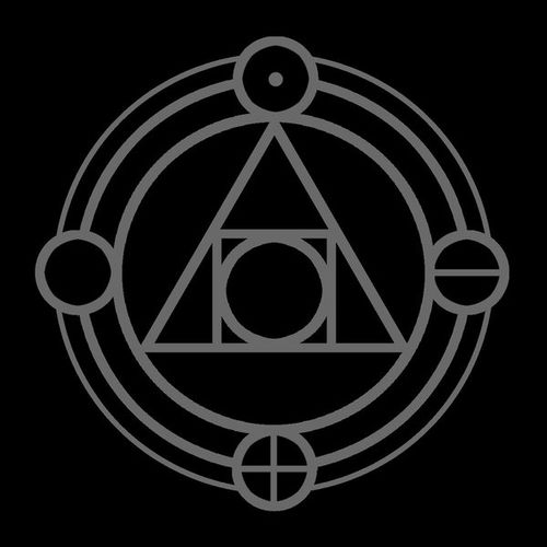
One of my favorite logos is this, which appears on Thrice's Alchemy Index releases, a 24-song 4-EP/2-album package that features songs composed to represent fire, water, air, and earth both sonically and lyrically. To this day, it remains one of my favorite albums of all time, and one of the earliest albums that diversified my taste in music, with all its variety and experimentation and such. The logo itself has always struck me as complex and intricate despite its formation of only a triangle, a square, and some circles. The four symbols I assume coincide with each EP. Fire is expressed by one single dot, perhaps in reference to how even a little can become disastrous. Water is expressed by a horizontal line; that's easy enough. The ocean. Air is expressed with a cross, which I take as a sign of elevation and lifting upward. Lightness, airiness. Earth rounds it out with an empty circle, which I interpret as a sign of how the planet is a blank slate until shaped by interaction with the lifeforms inhabiting it.

It's a neat logo that works on tons of levels, allows plenty of interpretation, is artsy in and of itself, and brings back nostalgia. 10/10.
3 Name: Xephlrek!9RNNck.4fo : 2014-03-06 01:37 ID:0VOfDQXP [Del]

>>2 omg a triangle its illuminati

4 Name: DeadsetFuture : 2014-03-07 19:34 ID:+3/F5hF5 (Image: 270x180 jpg, 7 kb) [Del]

src/1394242481608.jpg: 270x180, 7 kb

5 Post deleted by user.

6 Name: Bulma!gfkvD0.aME : 2014-03-11 04:14 ID:5UkDqeA+ (Image: 259x194 jpg, 3 kb) [Del]

src/1394529296606.jpg: 259x194, 3 kb
Kreator

What actually initially drew me to the band was their logo. Then I went and listened to Coma Of Souls and died with excitement. My lack of 'real' thrash metals pretty limited according to the internet but these guys are BRILLIANT.

Yeah I did fuck up above lol