Dollars BBS | Art

feed-icon

Main

News

Animation

Art

Comics

Films

Food

Games

Literature

Music

Personal

Sports

Technology

Random

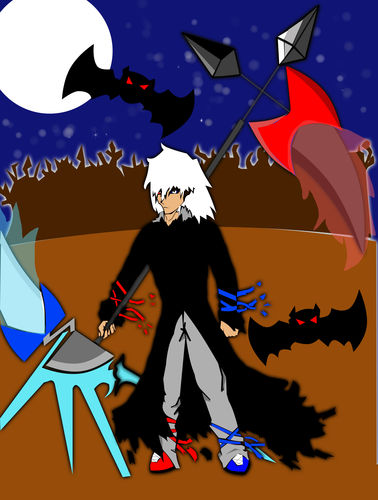
Character I made myself (fixed) (16)

1 Name: Darklight : 2012-01-05 22:05 ID:dOuJBRDH (Image: 1698x2242 jpg, 925 kb) [Del]

src/1325822704789.jpg: 1698x2242, 925 kb
It's fixed because my computer failed the first time. Anyways this is my image of a modern day grim reaper.

2 Name: Handle : 2012-01-05 22:34 ID:FdmzqQ4E [Del]

I can see that you've put in a lot of effort in this, but what I sense from that picture is that it's a bit... much, isn't it?

See, you've got this clutter of stuff all around your character, and I'm wondering if there is any purpose for what surrounds them, like the bats. The weapon is a bit flashy as well, isn't it? It distracts the eyes from what is the main focus -your character. However, how you design it is entirely up to you.

I suggest that you work with the colour scheme better. The brown really doesn't seem to match up with the black, blue and red, so try to choose a colour that's more aesthetically pleasing to the eye. Also, to give your image a more believable look, try incorporating some more shadow and tone. Think about the hierarchy of what you are creating -which technique do you want to be more prominent in your work? Where do you want to place things?

Other than that, I think what you did was a good try. Keep on trying at this, and experiment more with the functions of whichever program you are using, and you might be able to improve.

3 Name: Xissx : 2012-01-05 22:50 ID:aAKifSOR [Del]

I like it! I also sense a bit of Kingdom Hearts in this image. Did it influence you in some way?

4 Name: Darklight : 2012-01-06 00:09 ID:dOuJBRDH [Del]

Handle: I agree on the colour, it was for a contest at my school and I only had one day left so I coloured it as if I was doing a flash animation rather than colouring it with attention to the lights and darks. As for the brown, I was going to go with purple but then I got into one of those situations where you can't choose the right shade so I chose a different colour altogether... and the bats are there because the contest was for halloween.

And yes before I drew this I had just re-beaten all of the kindom hearts games.

5 Name: Darklight : 2012-01-06 00:09 ID:dOuJBRDH [Del]

And thanks for the input!

6 Name: Darklight : 2012-01-06 00:10 ID:dOuJBRDH [Del]

Also I just really like making flashy weapons...

7 Name: Handle : 2012-01-06 00:22 ID:FdmzqQ4E [Del]

>>4 >>5 >>6 Ah, now I see. Lol, okay then.

8 Name: BarabiSama!!C8QPa1Mt : 2012-01-06 13:20 ID:z8lvIN+G [Del]

I think it's decent, but you should work on your proportions and design a bit more. The grim reaper looks very short in this picture, or perhaps more midget-like. He has these broad shoulders and long arms, but his legs are so short compared to the length they would normally when in proportion. He's like... a white haired Napolean lol With a really thin neck :O

I personally like the weapon, but it looks really heavy because the character is tilting slightly towards in, making it look like it's dragging them down. If he's the grim reaper, you figure that he would have figured out how to carry his weapon by now.

What's in the back in the darker brown? I can't tell if it's a wildfire or an angry mob. One more thing and I'm done: because everything else is very clean-cut, I think you should have left the stars as five point stars or dots. The style of them really contradicts with the style of the rest of the picture.

On a good note, I love the cloak, though it's very non-traditional.

Well, those are all my crticisms ^^ It's decent, but it can always be better, you know? There's no such thing as a perfect picture.

9 Name: Drg0nR3apr : 2012-01-06 14:43 ID:dOuJBRDH [Del]

This is Darklight, im changing my name. when i put darklight that was supposed to be the characters name...

Short huh...in most animes i watched they all had different proportions so i didn't look at too much. Same goes for the weapon i didn't think about weight since a lot of animes have outrageously strong characters whereas i thought tilting the weapon just made it look cooler.

In the back it was going to be a bunch of detailed trees but since i didnt have much time i just outlined the trees and used the paint bucket.

The stars/moonshine was just my brother *trying* to help me although i was actually against. i was planning on using a subtle noise effect on the background layer.

Thanks for the comment about the cloak and thanks for you input.

ill post the original drawing if you want to see it.

10 Name: Drg0nR3apr : 2012-01-06 14:51 ID:dOuJBRDH [Del]

So the original is up now. take a look and see if i can change anything else.

11 Name: Drg0nR3apr : 2012-01-06 14:52 ID:dOuJBRDH [Del]

And here's an interesting fact. Napolean actually was an average height. The scale for measurement they used in the past was smaller than what we have now and thats why people think he was so short.

12 Name: Marcy : 2012-01-06 18:10 ID:0Rwhr82H [Del]

He's cute ^^

13 Name: Drg0nR3apr : 2012-01-06 18:23 ID:dOuJBRDH [Del]

Thanks

14 Name: BarabiSama!!C8QPa1Mt : 2012-01-07 09:14 ID:z8lvIN+G [Del]

>>9 I didn't say the weapon was tilted; I said the person was tilted. It makes it look like the character is really weak. And no prob.
>>11 No, Napolean was short for the time, at least, according to all I've read. It was put into scale for the height of the time in my history book. So either, wherever you got that fact from, you're unfortunately mistaken, or my book is wrong :V
15 Name: Drg0nR3apr : 2012-01-09 06:24 ID:dOuJBRDH [Del]

heres my source you can determine if it's right or wrong

http://europeanhistory.about.com/od/bonapartenapoleon/a/napoleonheight.htm

16 Name: BarabiSama : 2012-01-09 09:16 ID:OTQ/r+cQ [Del]

>>15 There's no solid proof to one or the other and websites aren't the most reliable resources, so I guess neither of us are right. Ah, well.