1 Name: Jynxed : 2010-11-23 01:54 ID:pxznK8wt (Image: 915x733 jpg, 415 kb) [Del]

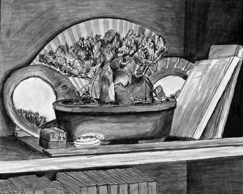
Can I get some con-crit on this, and post your stuff. I'll exchange advice with you!
2 Name: Irk !Y7kBtlCaVo : 2010-11-23 02:28 ID:1BFqraHJ (Image: 720x540 jpg, 52 kb) [Del]

That's really goddamn nice.
I would say that the shading could be smoother,
unless you're going for that look.
Other than that.. Maybe a little more dynamic shading? Or, contrast, rather.
Not too much other than that though.
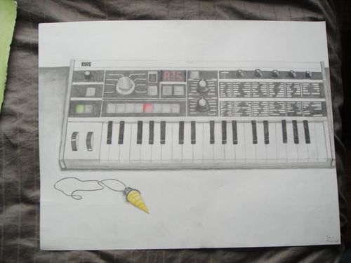
Keeping with the 'black and while still life' theme, here's something I did about.. 8 months ago.
3 Name: Jynxed : 2010-11-23 03:18 ID:pxznK8wt [Del]
That's also really nice. The drill, is that from Gurren Lagann?
The pencil shading on the front side of the keyboard could use some evening out. If the light was reflecting so that there were highlights, you need to either create more of a gradient or a sharper edge to the light and shadow.
The red on the screen could also use some brightening. Try to make it richer. Either more saturation or cleaning the space with an eraser and then laying the red back in.
The perspective on the corners is also off. It's a bit too sharp of an angle. You'll notice that it doesn't match the lines of the keys. Don't be afraid to make it perfectly straight. The rightmost knob is also not quite right. I believe that it's the curvature given to the knob- it doesn't match up with the leftmost one, which I think looks rounder and more 3-d.
You could also use some contrast between the top section of the background and the keyboard. A light tone will likely be sufficient, though I recommend also deepening the tone of the surface it's on. The shadow next to the keyboard on the bottom surface also looks a little odd. It appears more like a thick line than a shadow. I would either accentuate it or get rid of it. The bottom shadow also should be evened out.
You have a really nice mechanical style that lends itself well to still lifes like this, which have mostly, if not all sharp lines. You also show an obvious skill with metalic gradients, though the mechanical style seems to play against the softer shadows.
On the topic of my piece, yes, it was intended to have that look, since I was working with ink brush-pens. Unless you're very, very, very careful and have a very steady hand, it's hard to get it to appear smooth, and anything aside from a sharp gradient is impossible. Instead I work so that you can see the strokes and shading.
What do you think about a darker shade in the lower shelf?
4 Name: Keiyukan : 2011-12-09 04:27 ID:iReS2lU4 (Image: 289x492 jpg, 21 kb) [Del]

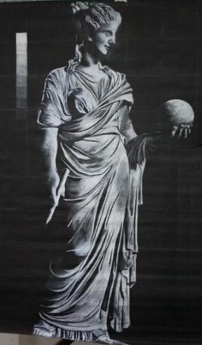
for Jynxed: I can't judge that much about how it may resemble the real subject but your technique is amusing enough. If you really want it to look exactly like the real picture, just like a hyper realist, you may have a lot to polish in your skills but honestly, your technique is already fine and well identified. So, yeah, it goes like that, I guess.Besides, may I know the medium you used?
As for Irk: I am quite attracted to your style and the juxtapositions of the two subjects is very interesting. (was it intended...? Anyway, it made a picture of a keyboard less boring and eye-catching.)
Shit Bricks, talented people.
